

RWD Responsive Website RWD Responsive Website
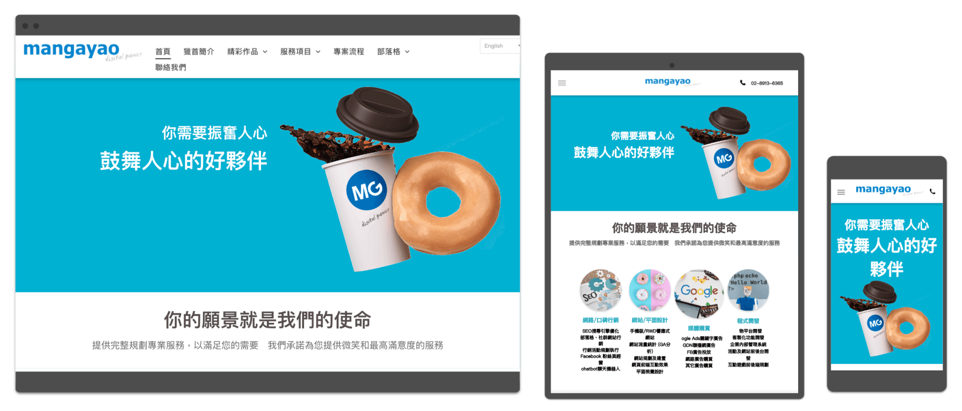
Web design technology that allows websites to be viewed on different devices (from desktop monitors to mobile phones or other mobile device devices) with different resolutions, reducing user zoom, pan and Rolling and other operational behavior.
Responsive web design (abbreviated as RWD) can support a variety of screen application website design, complete... With the popularity of mobile devices, it can support PC / tablet / mobile phone at the same time, giving users the best browsing screen to meet the needs of mobile users. Using habits is equivalent to winning the biggest business opportunities.
Responsive web design:
Responsive web design (often abbreviated as RWD), or responsive web design, responsive web design, and corresponding web design. It is a web design technology that allows websites to be displayed on different devices (from desktop monitors to mobile phones or other mobile device devices) with different resolutions, reducing user zooming, Operational behaviors such as panning and scrolling. For web designers and front-end engineers, unlike the past, different designs were required for various devices, and using this design method would make it easier to maintain web pages.
What is the difference between responsive and adaptive?
Responsive website design: It will automatically “smoothly” zoom according to the size of the screen. Most of them will have 5~6 sizes, which is the most common web design method. Advantages: The interface experience is consistent, the management of the layout is solved to adapt to different devices, and the use of a single URL URL can enhance the effect of SEO. Disadvantages: The process of shrinking, but also the structural changes. When the level and amount of information are large, the things presented are limited. Responsive>>> from large to small, if the amount of information on the website is not so much, users can do very little things on the webpage, and they can achieve the desired purpose. The RWD response method is better, because it is the most convenient to maintain, it can also There is a consistent visual experience.
Adaptive Website Design: Adaptive Web Design, also known as the AWD website. Only for the three sizes of computers, tablets, and mobile phones, the most emphasis is on priority. Advantages: Designed for mobile phones, fully optimized website features. Disadvantages: Maintenance takes more time, and it can't be completely different in various screen sizes, so it is necessary to make a responsive design within a certain range. Adaptive>>> is small, medium and large. If the information volume of the website is very large, users need to do a lot of things on the webpage, and choose AWD adaptive website, because they can customize the experience on the mobile phone.
Common Benefits 1. Optimized use experience: When you don't want users to want to do actions, don't know where to go. 2. Allow users to focus: Only one thing can be done at a time, in order for the user to reach what you want him to do as quickly as possible. 3. Make the website faster: This is related to the program design of the website. Can the user open the webpage within 2~3 seconds? There is data indicating that when the webpage cannot be opened within 2 seconds, 47% of the people will impatient.